2015
Concept for Shoe Store Web Promo
Concept for
Shoe Store Web Promo

Sole What is the best kicks store in Malaysia offering its customers a great variety of brands and models and regular deals.
Role —
Concept Development,
Design & Art Direction,
Prototyping
Details
Bolder typography, richer imagery and of course interactivity. My goal was essentially to create the experience where each featured product could stand out more on its own while users are engaged
and spread the word. Some kind of promo platform with user generated art and contests to increase awareness and boost sales.
New Dynamic Logo
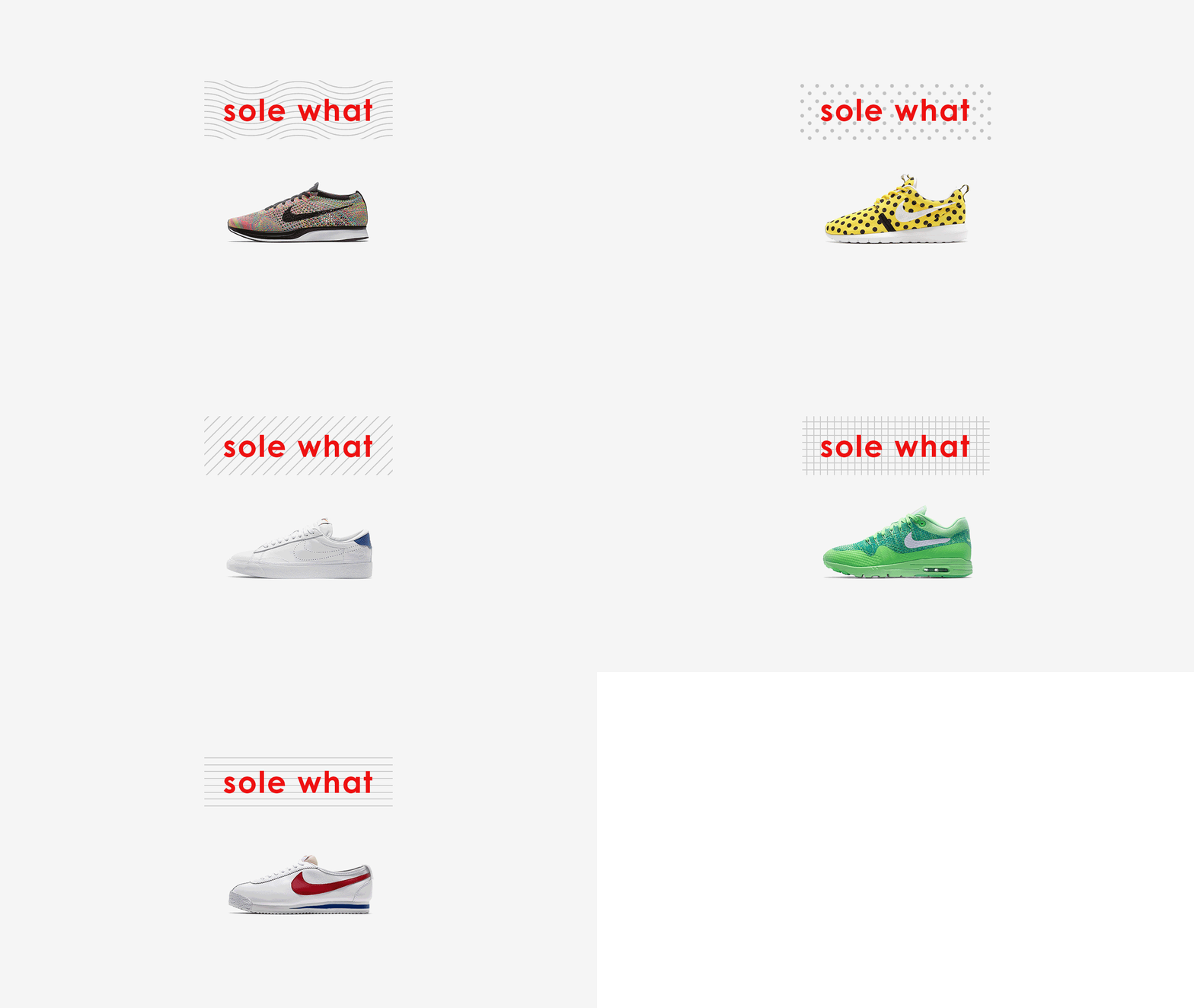
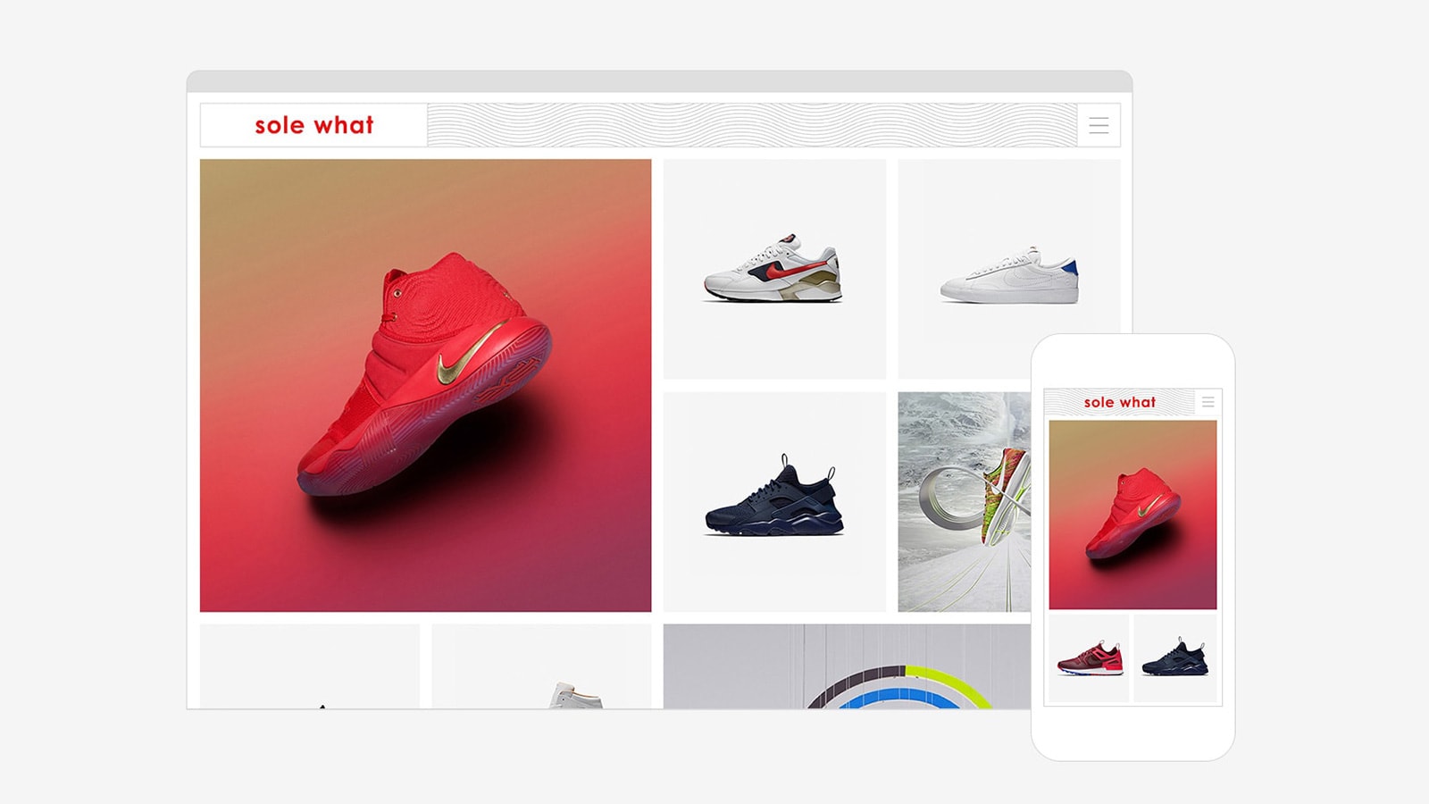
I started with a logo refresh. Vivid red color for the wordmark create high contrast with minimalistic patterns in the back. Pattern changes based on a shoe model creating custom variations of the logo.
Promo Home Page
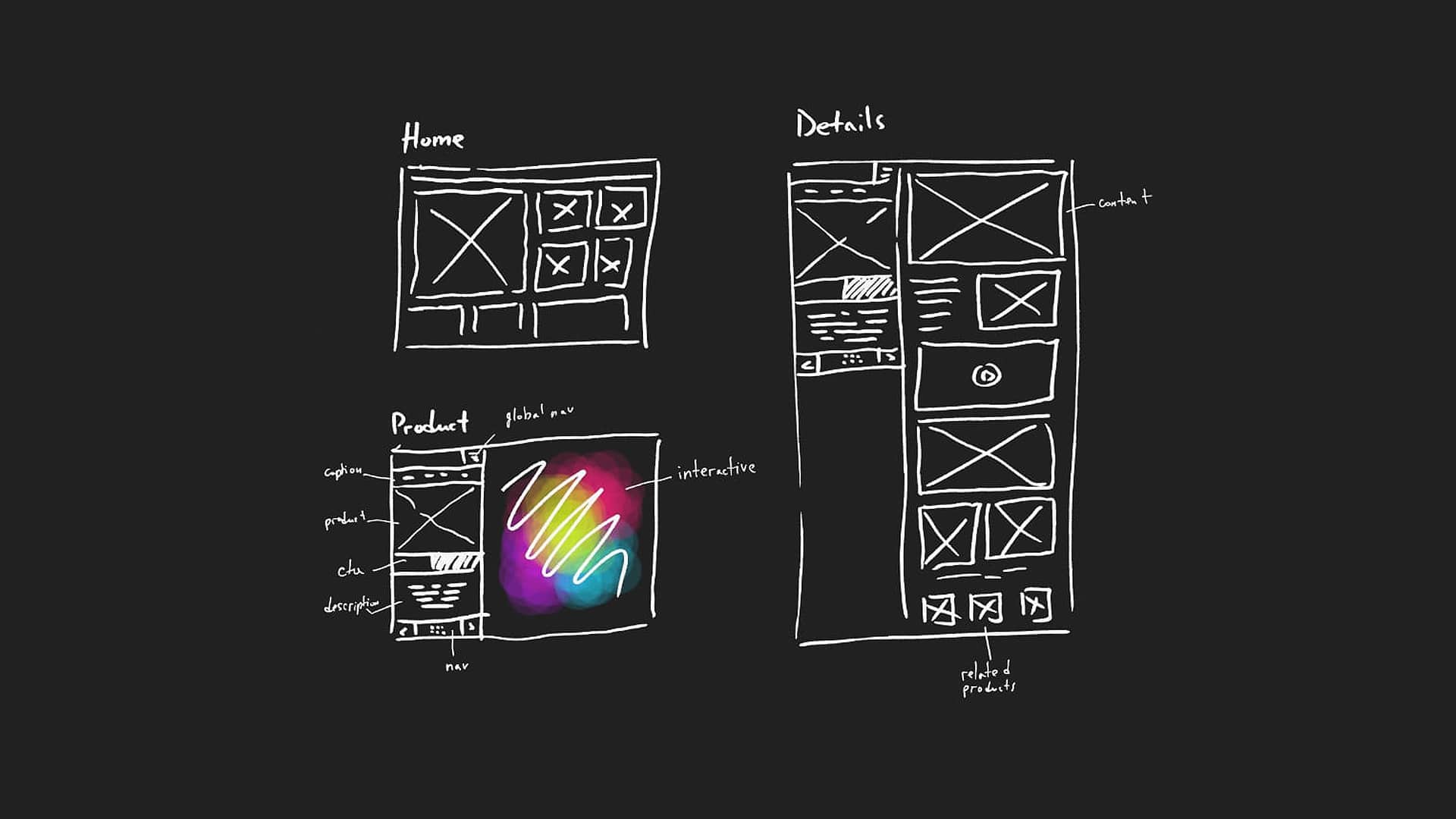
Visible grid system allows to smoothly separate products and highlight the featured models. As the result, all the attention goes to kicks and nothing distracts the user.
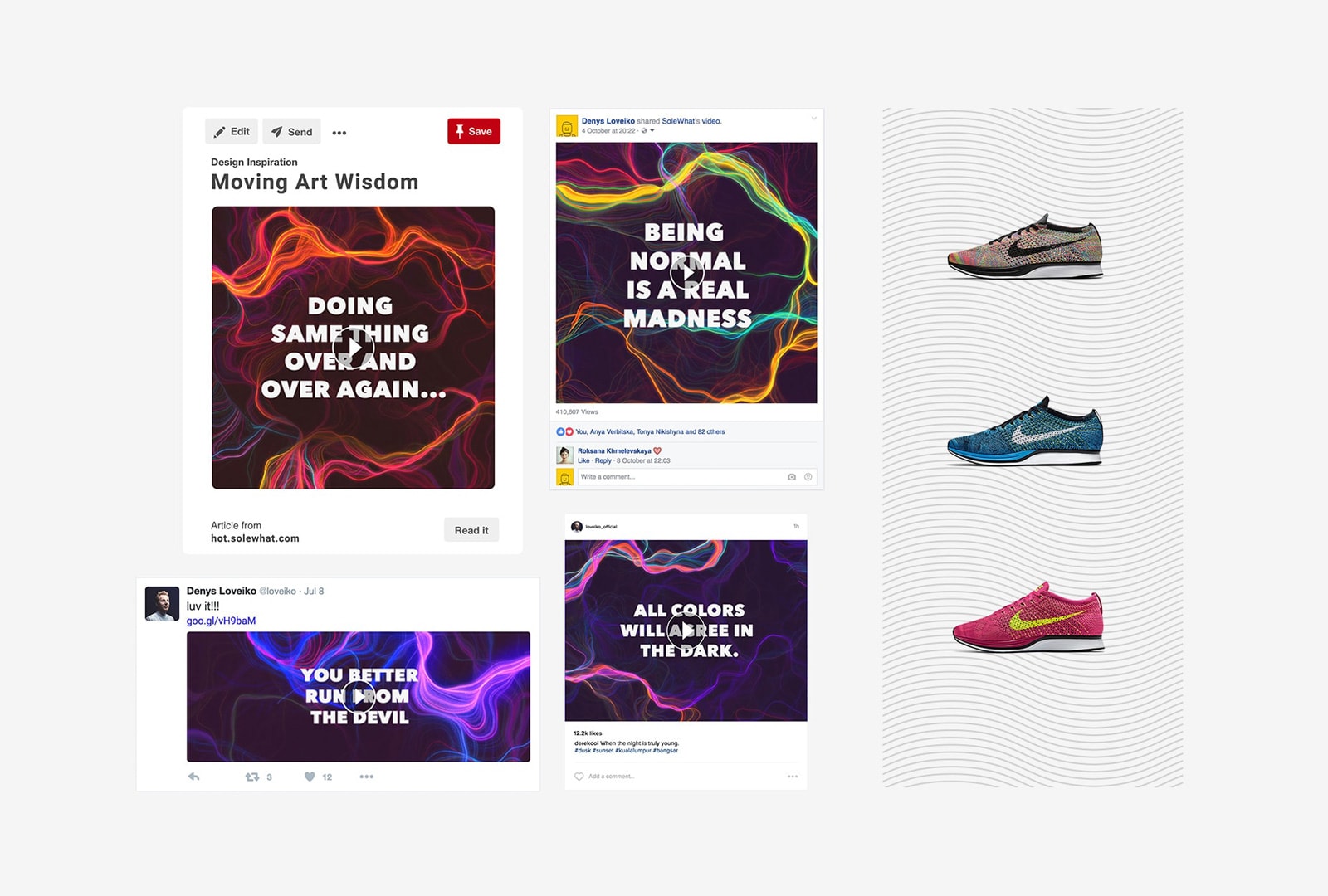
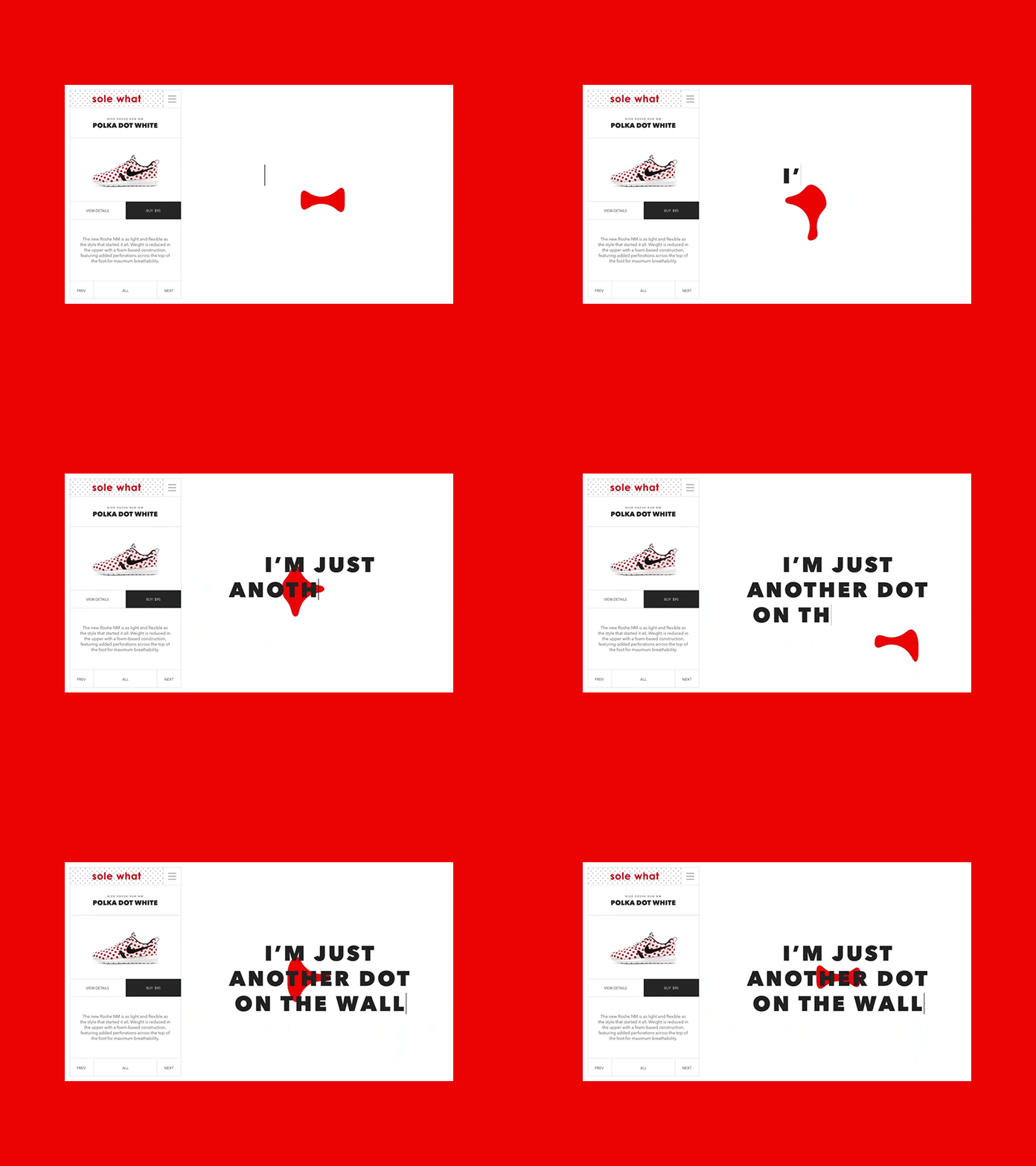
Content Creation
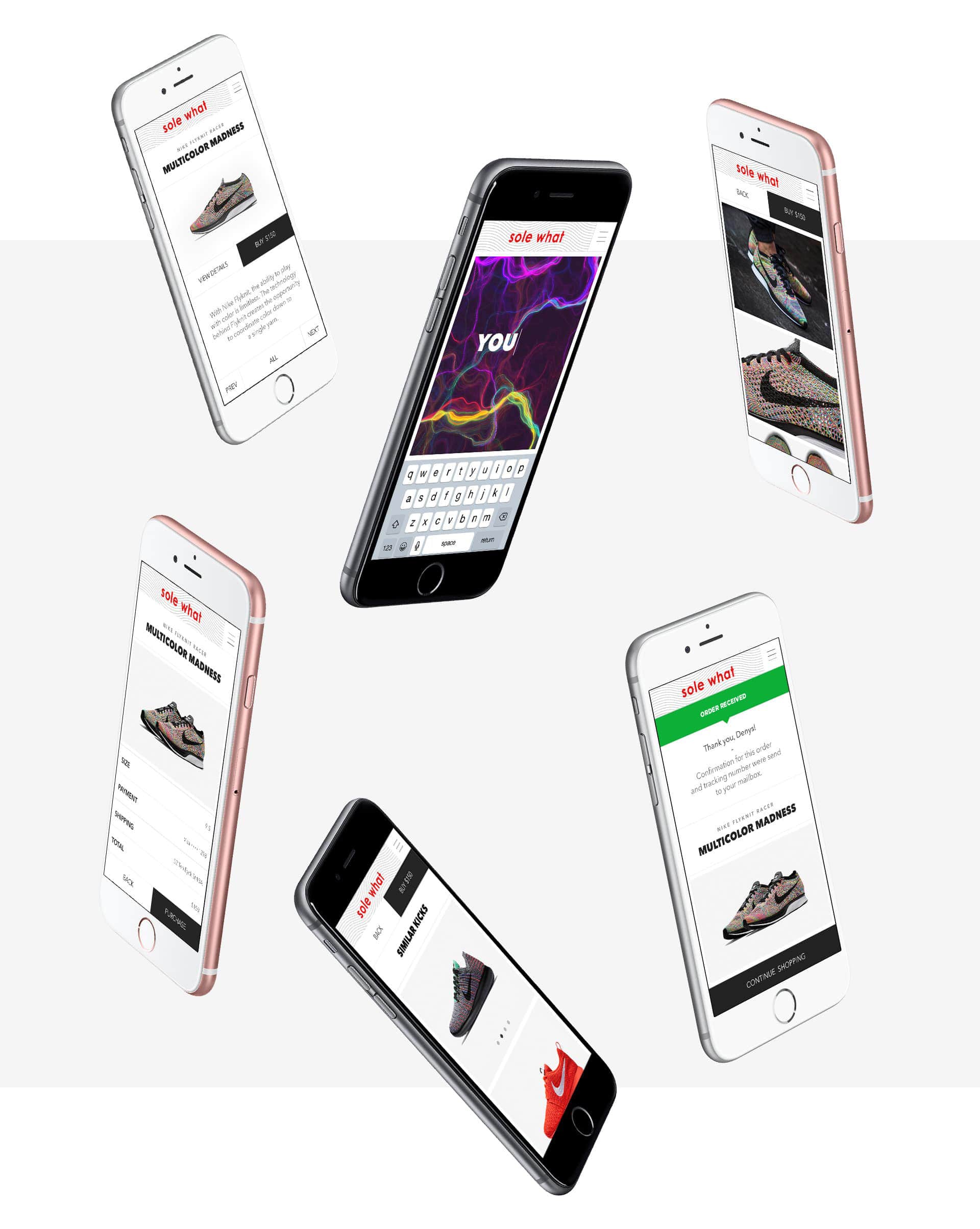
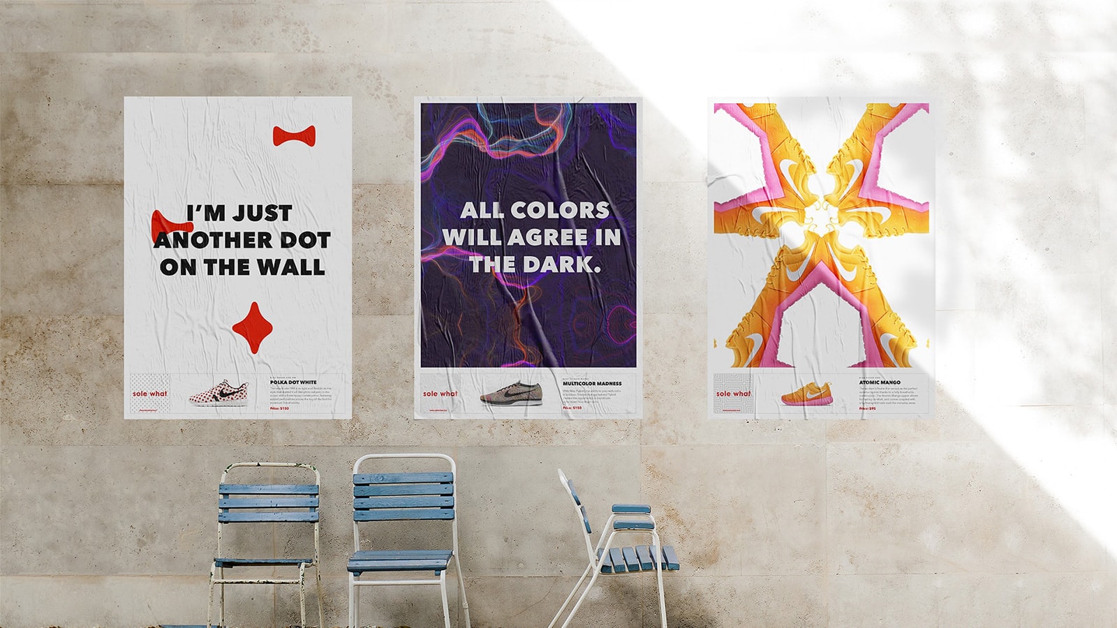
Once you picked the kicks you can create and share your poster - still or animated - with a minimum of effort. Just start typing your message to the world that best represents the mood of the kicks and magic will happen.
Every month those who earned the highest recognition stand a chance to win kicks for free or get a good discount. While users are having fun SoleWhat is growing its brand awareness and loyalty.

Promo Details Page
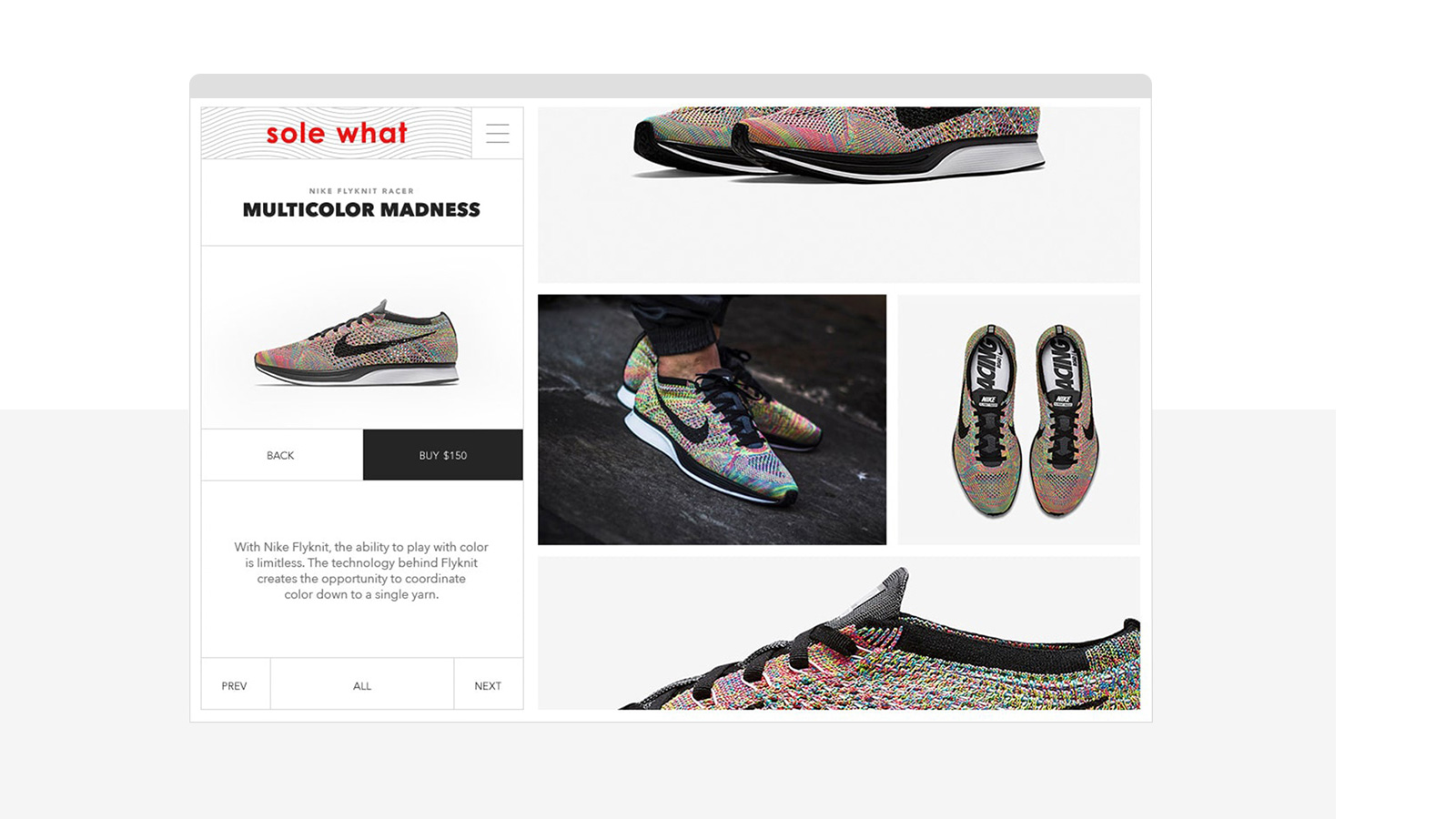
Short description, lots of pictures, related products, unboxing videos - all of this will help to convince you that these kicks is exactly what you need 😉
