2015 — 2017
Reimagining  the home of personal growth
Reimagining  the Home of
Personal Growth

Mindvalley is the world's biggest online/offline school of personal growth with over 3 million students worldwide.
Role —
Concept Development,
Creative & Art Direction,
Design & Front-end Dev
Team —
Head of Marketing: Troy Allen
Copywriter: Tania Safuan
Project Manager: Sid Anantharam
Awards —
CSS REEL: Site Of The Day,
Design Nominees: Site Of The Day,
BEST CSS: Site Of The Day,
CSS Light: Site Of The Day
Challenge
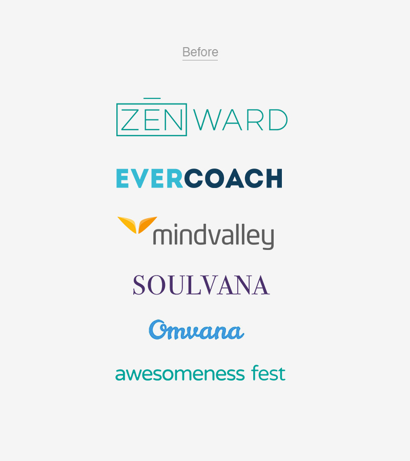
Founded in 2005, Mindvalley was just a digital publisher but over the past 10 years the company expanded its business dramatically. Mindvalley has opened a few international branches, went offline
organizing global events and meetups, started developing iOS/Android apps and learning platforms in-house, and succeeded in creating courses with the most famous teachers of the industry. However this had not been conveyed
properly as a single brand.
Approach
Having joined Mindvalley back then, I couldn't have noticed how big the potential was if not the inconsistant communication. What I started as the initiative turned into the full-scale project
later. Due to a lack of resources the entire design and development production ended up on my plate. Having the head of marketing by my side, we developed the new brand design and the strategy that communicated Mindvalley
as a coherent and solid "brand umbrella".
Outcome
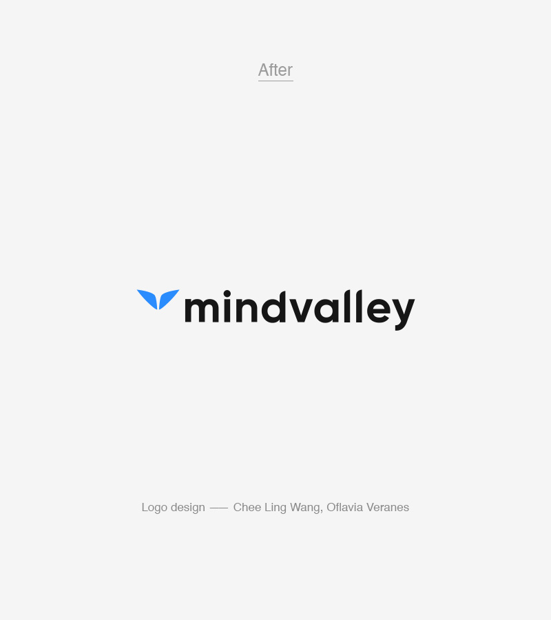
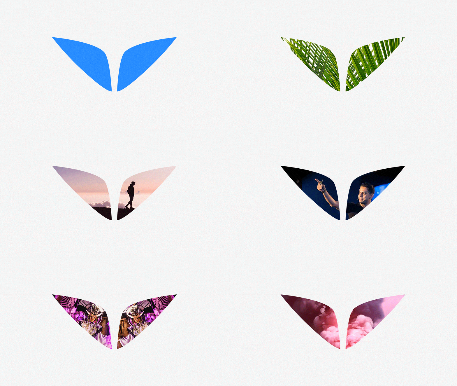
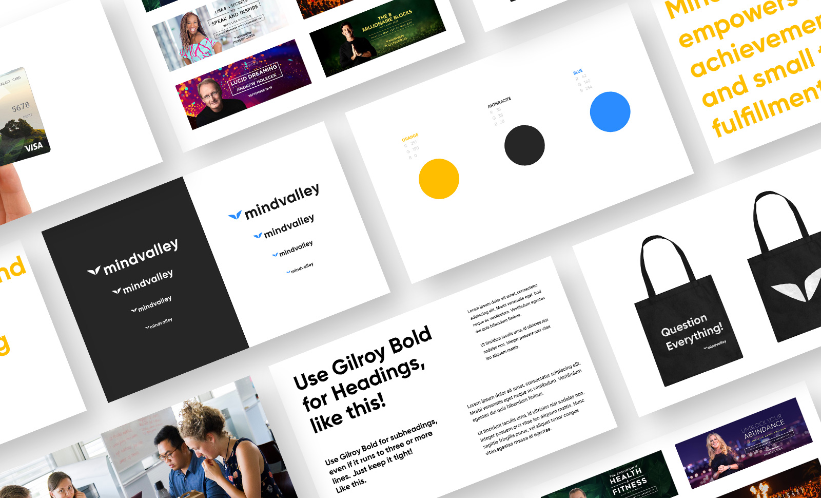
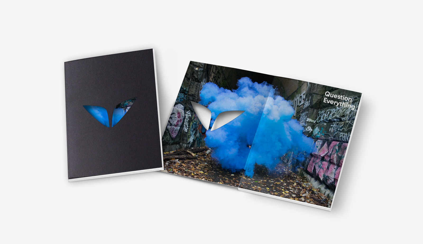
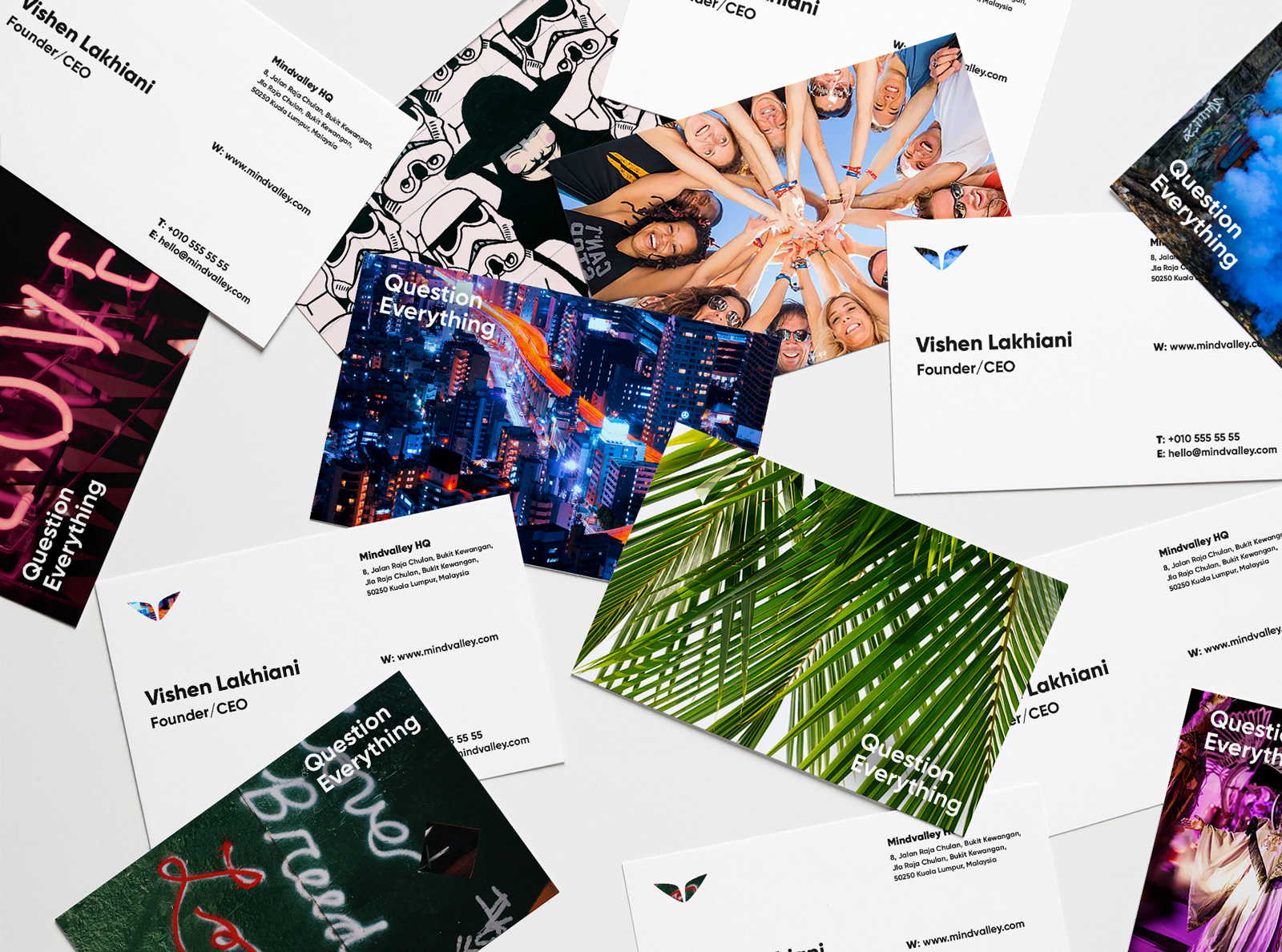
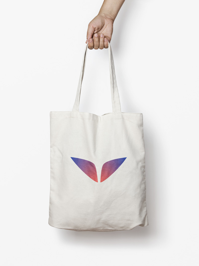
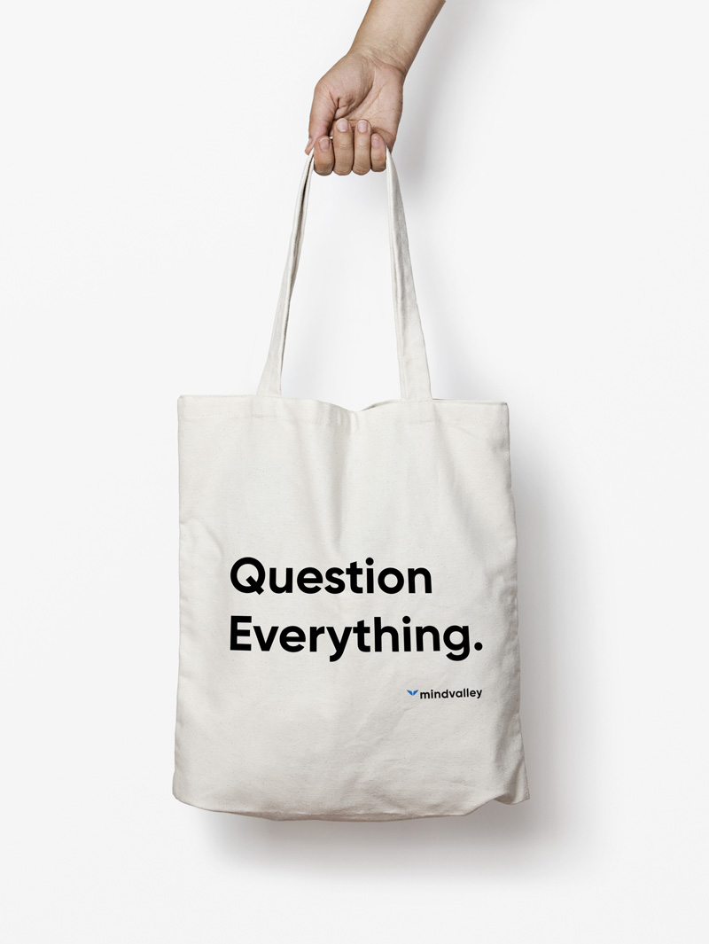
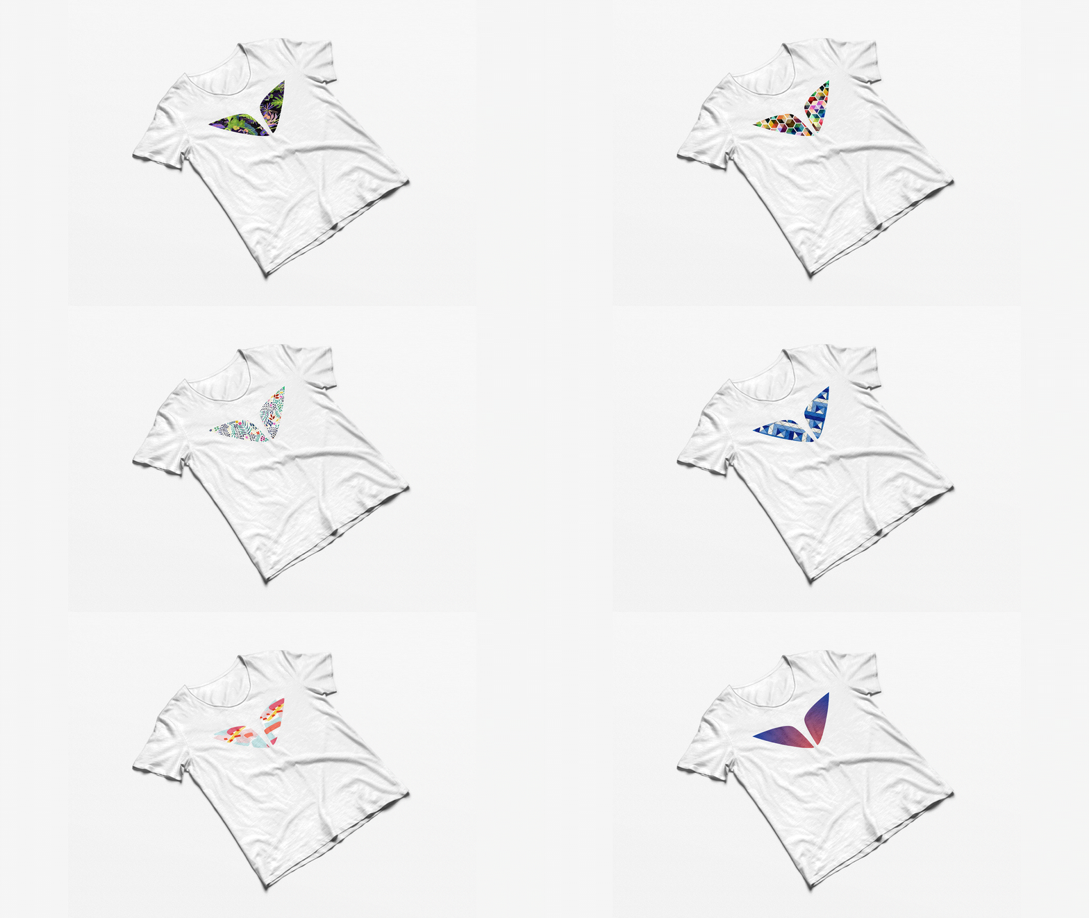
The new brand identity goes far beyond just a logotype. Ii is more of a system composed of a number of main elements that come together to create a distinctive visual language that makes Mindvalley
brand solid and instantly recognizable. The new brand identity had a great impact internally as well, more and more employees including leadership board started contributing to the solid brand rather than separate products
and services.
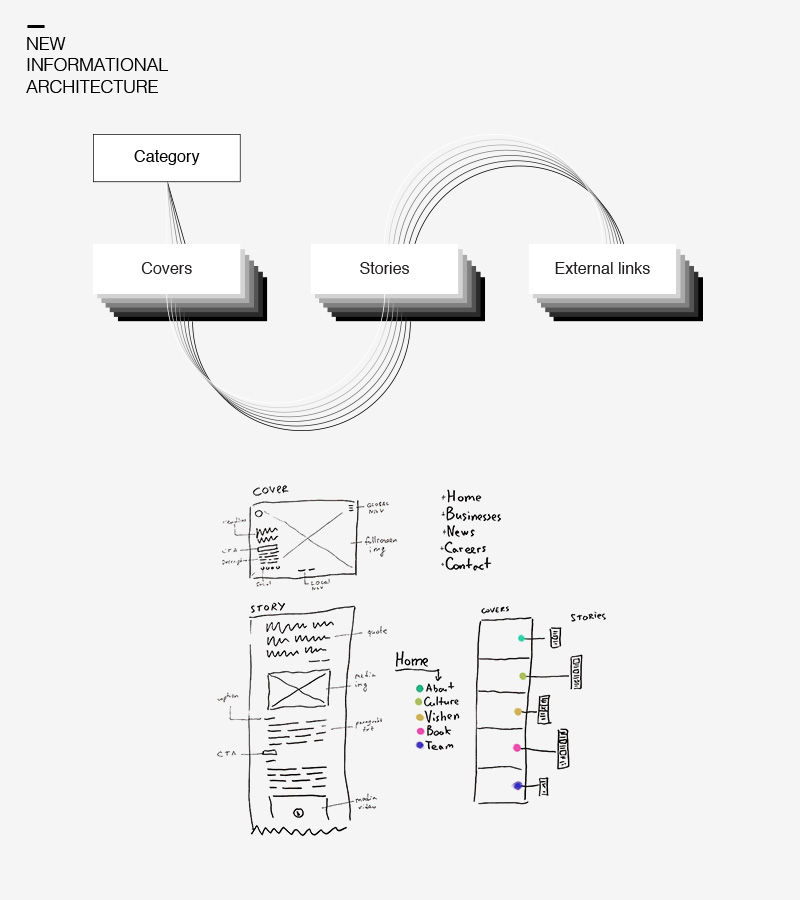
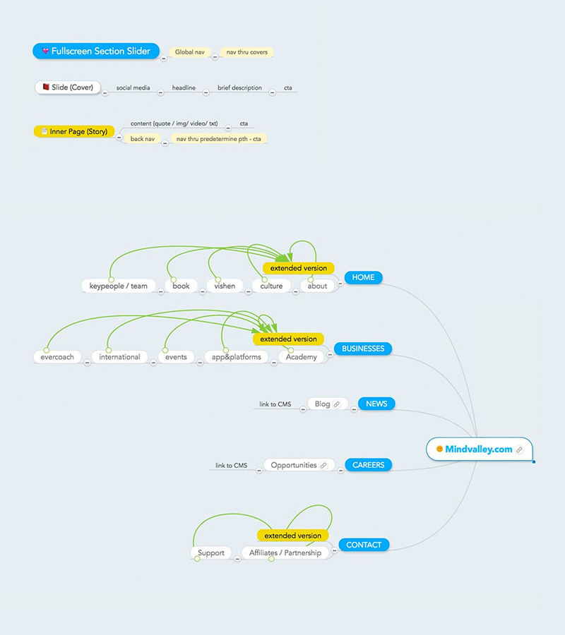
Our main goal was to ensure that every user can quickly find right information
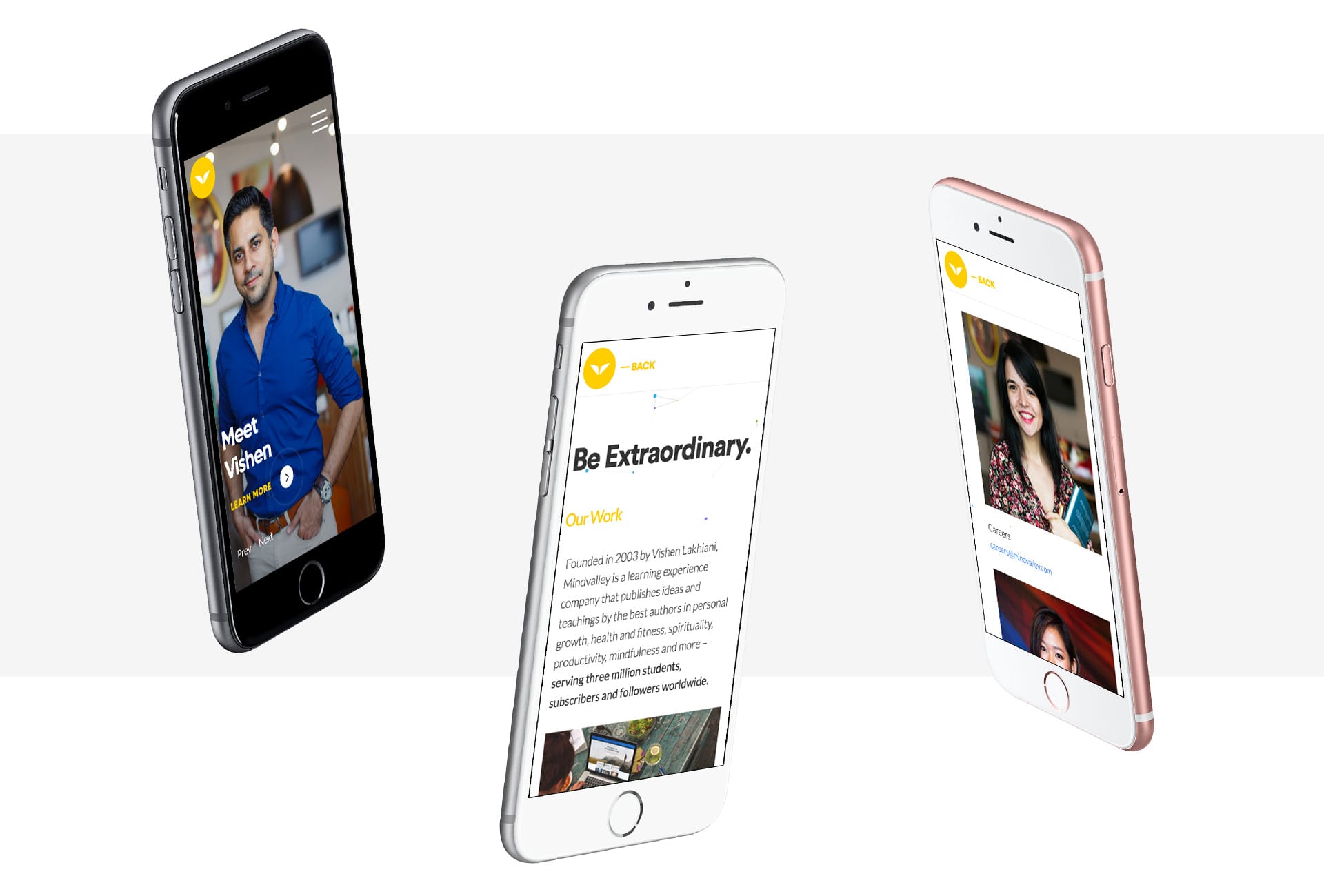
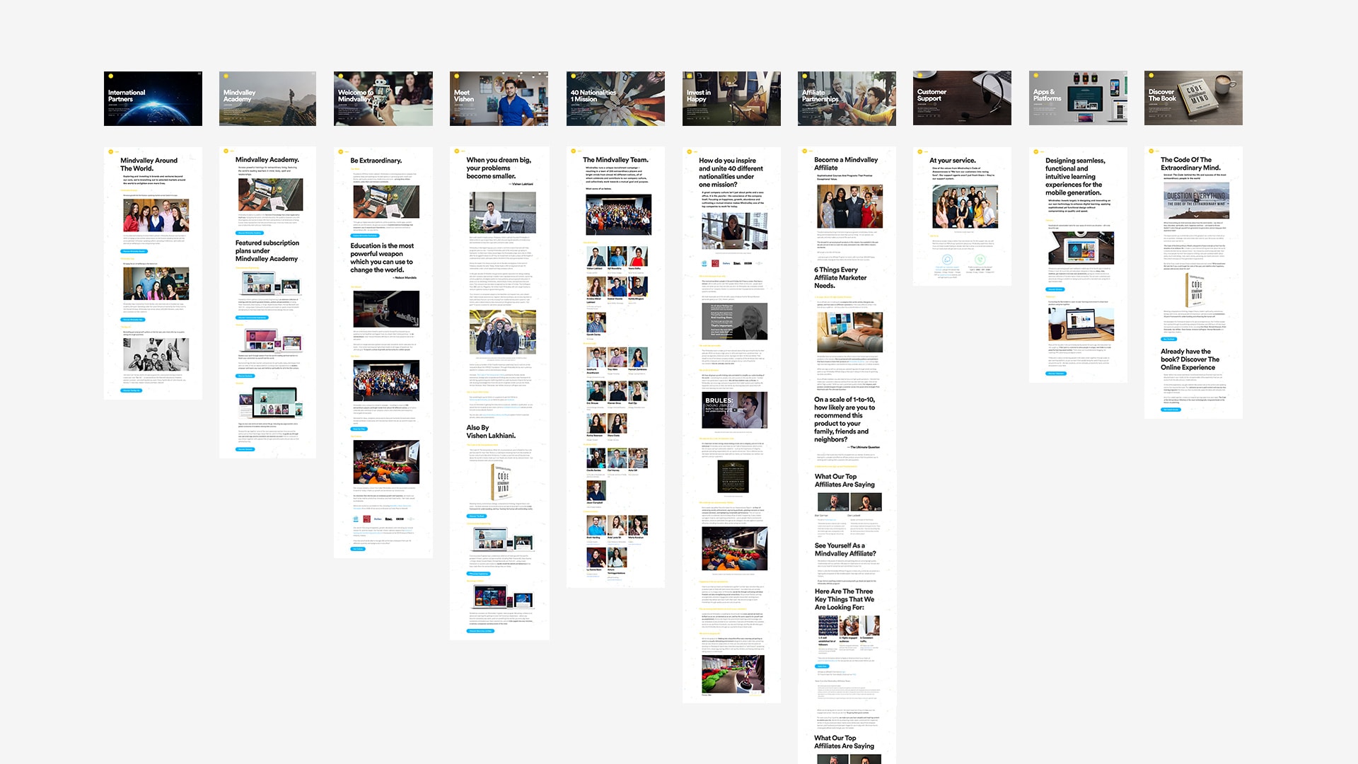
We focused on similarities between segments that helped to achieve perfect grouping based on context. Visual, easy-to-navigate structure & human oriented design creates enjoyable journey across the website and deliveres advanced user experience.
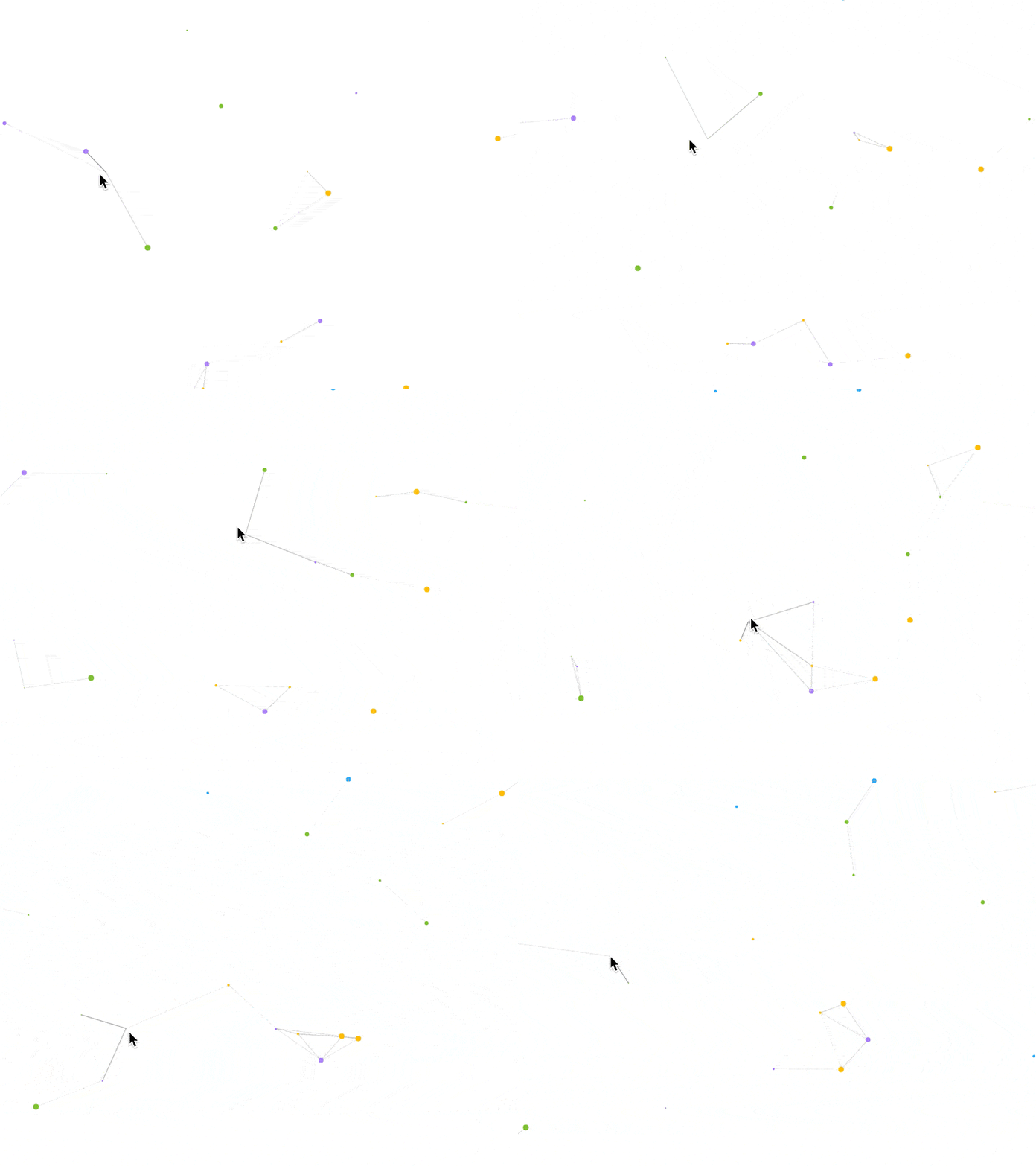
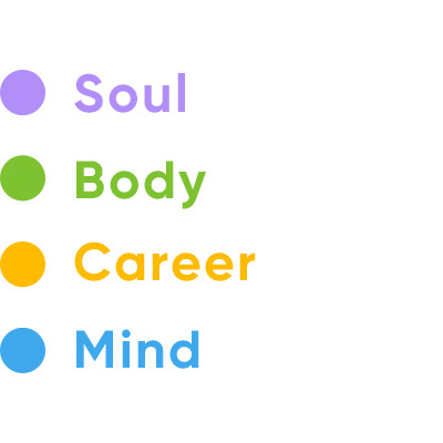
Interactive background with particles looks clean and feels innovative, customers like "connecting dots" especially when each dot represents different area of personal growth:
